Designing a health app
DURATION:
2 WEEKS
ROLE:
PRODUCT DESIGNER
TOOLS:
FIGMA + PHOTOSHOP
Objective
Our mission centered around Health App Design as my team of three exceptional UX designers and I embarked on creating a wellness app for the Daily Health Conference and its attendees. This non-profit organization is dedicated to promoting health and wellness globally through impactful talks, workshops, and training. Our goal was to present our innovative Health App Design idea in the segment meant for emerging health startup concepts.
Rather than delving into the intricate workings of our app, I’ll succinctly explain how we navigated through a 2-week sprint.
What I did
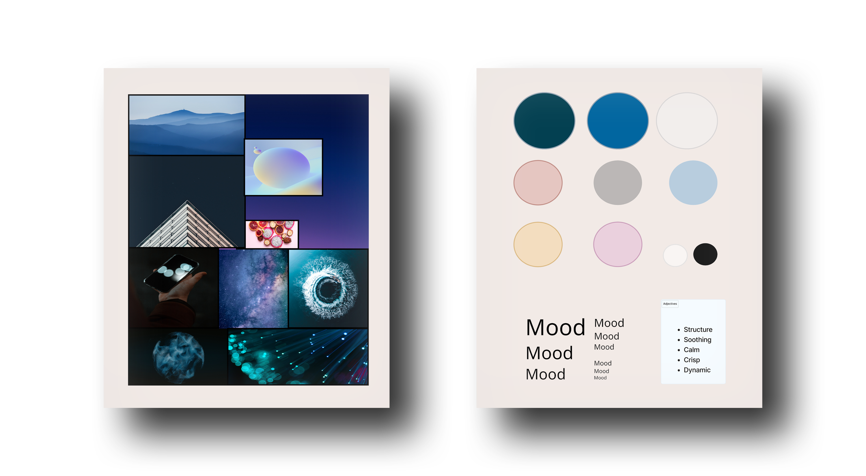
My focus was on the entire design process. Additionally, I took charge of the brand attributes and the mood board.
What I’ve learned?
Iteration is a vital part of the design process. And teamwork makes the dreamwork. The team’s commitment to backing all decisions with research required patience and led to some frustration. However, despite the sprint of 2 weeks, the result was satisfying. We delivered a product we fully believed in, and it resonated with our audience, showcasing the power of collaboration and perseverance in the face of tight deadlines.
Table of contents
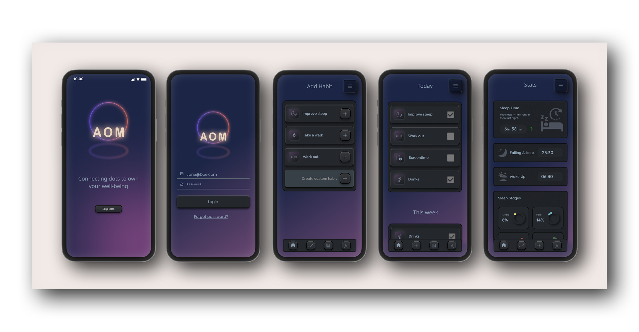
MVP
Our MVP aimed to:
- Rethink how users can adopt and commit to a health-improving routine.
- Address well-being aspects, offering a unique or improved experience in a saturated market.
- Enable users to monitor progress and encourage healthier lifestyles.
Before diving in, we created a roadmap outlining our daily tasks, answering questions about our product’s direction, functionality, and purpose. Daily standup meetings ensured we stayed on track.
Discover
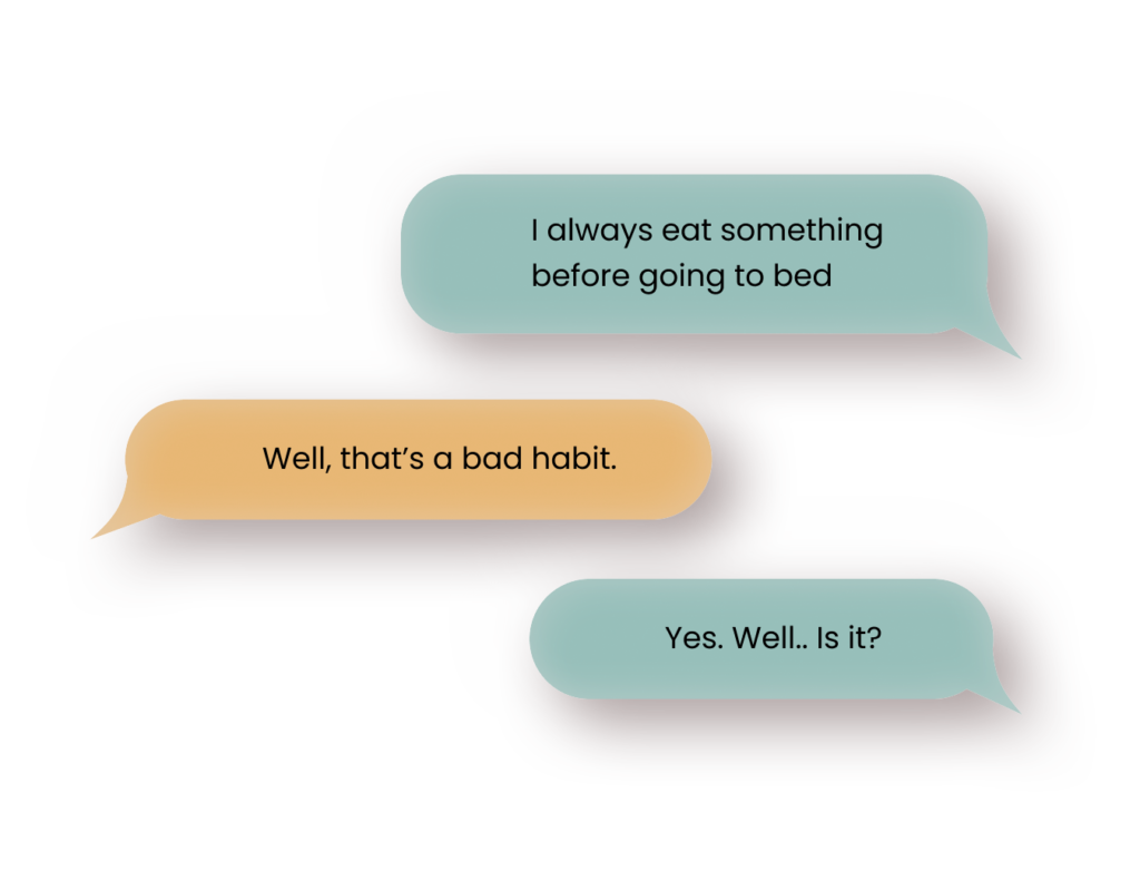
As a team, we decided to design a habit tracker. After defining what a “habit” is, we set goals and individually began secondary research on everything related to habits. We guided ourselves with questions such as:
- What is a positive habit?
- What is a negative habit?
- What are the most well-known habits?
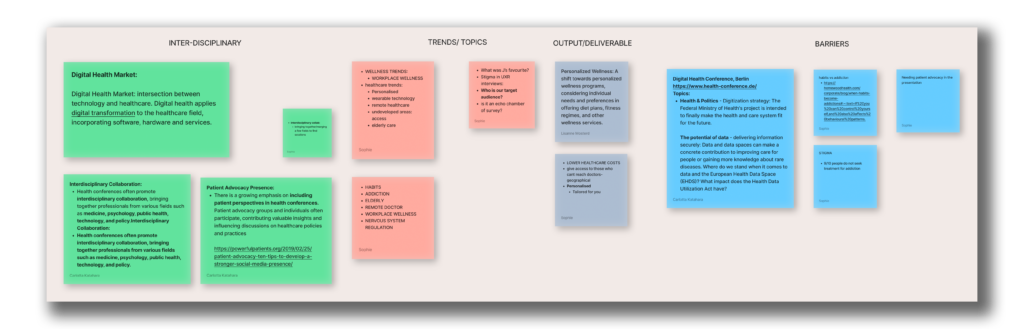
Our findings were clustered and categorized for a clear overview of our conclusions. Using these, we created a survey to gather insights from our network, aiming to understand perceptions and pain points related to habits. Survey conclusions helped formulate questions for qualitative research with individuals within the target demographic. Data from these interviews informed an affinity diagram, laying the foundation for the user persona.
Define
Using the gathered info from quantitative and qualitative research, we easily crafted a persona, giving us a clear picture of the problems and needs related to our chosen topic. This, in turn, helped define a problem statement, which, due to our commitment to research-backed decisions, required multiple adjustments. This dedication to research extended our process, causing some frustration, but we believed it would enhance our end result. And it proved to be a wise decision.
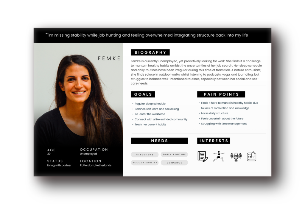
Problem statement
People experiencing uncertainty during times of transition need to find a way to gain awareness of their daily routines. Because they struggle to stay motivated, lack accountability, and lack insight into how habits and moods are connected.
Develop
After a competitor analysis using a SWOT analysis, we engaged in a round of “crazy 8’s” to generate ideas for what users would see our app doing within 8 minutes. No idea was considered wrong, fostering collaboration and improvement.
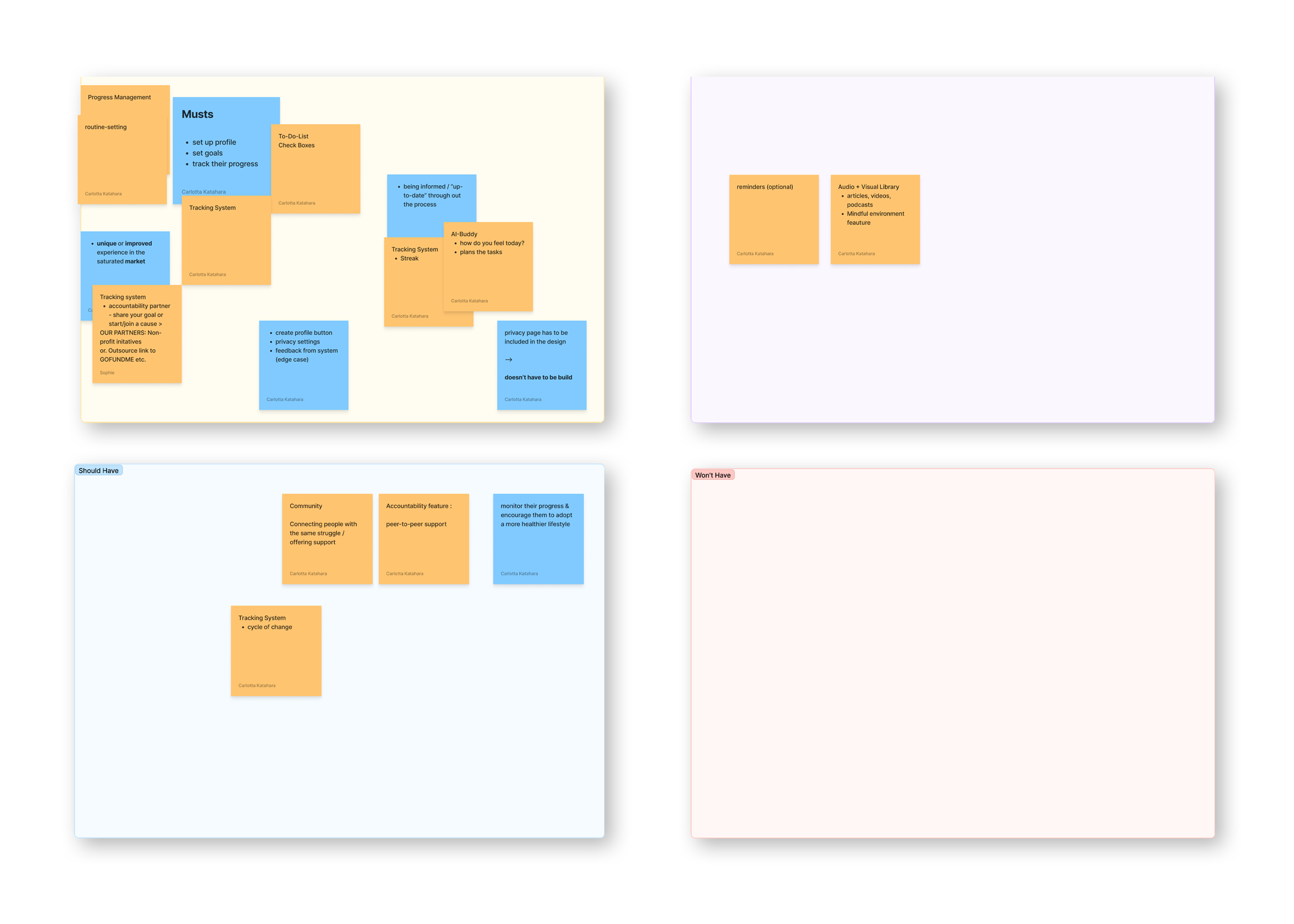
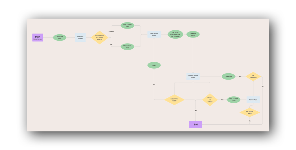
We used the MoSCoW method for feature prioritization, making it clear what our app must have and what could be optional. This streamlined our work on the MVP. A user flow was created with a happy path, considering our limited project time.
- SWOT
- Crazy 8’s
- Userflow
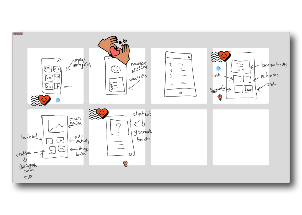
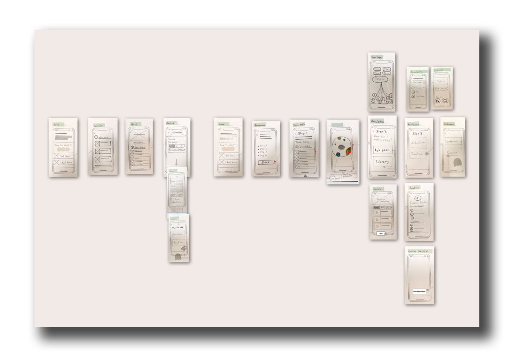
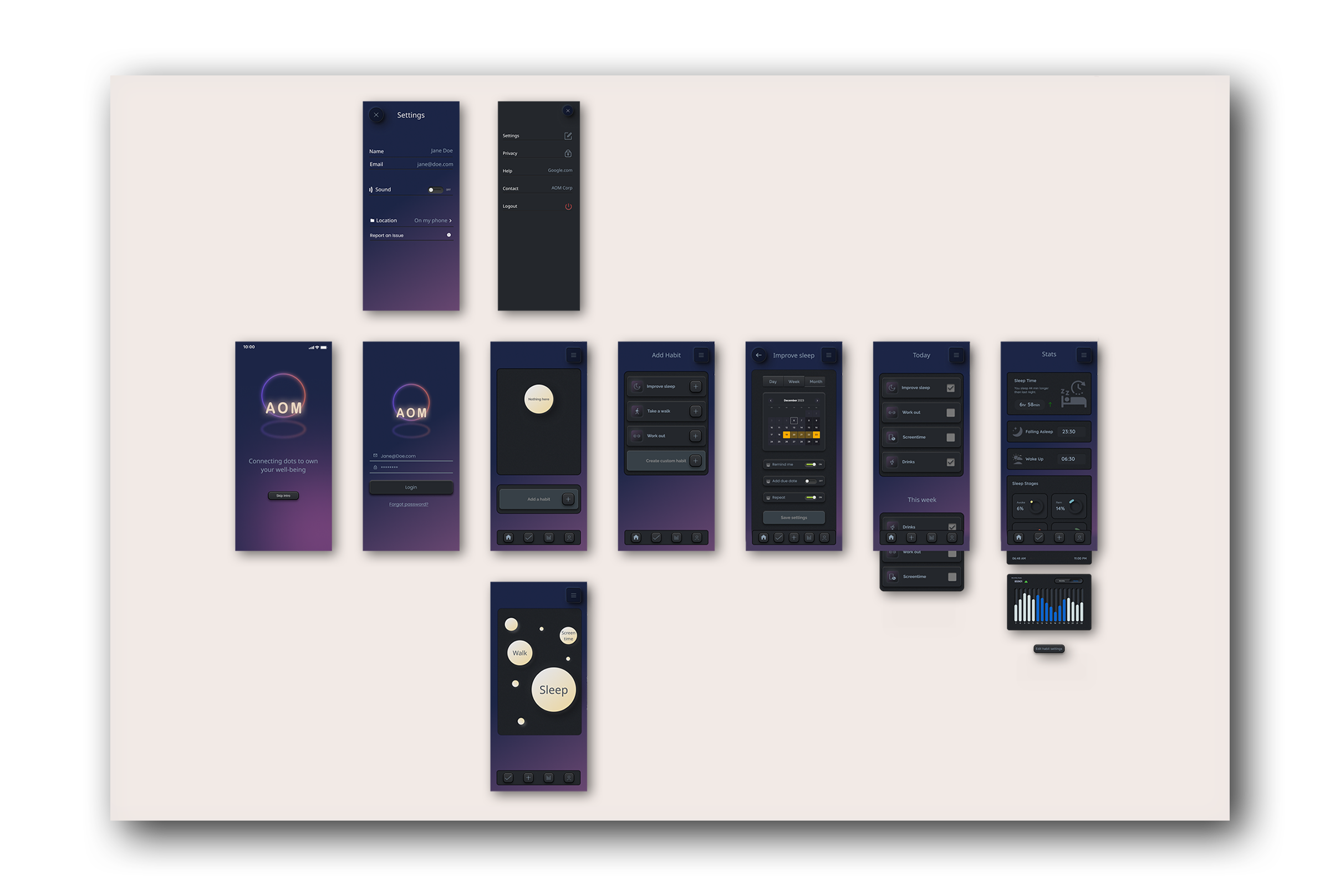
We then developed lo-fi and mid-fi prototypes. And subjected the latter to concept testing before reaching a hi-fi prototype for user-testing and the implemantation of the brand attributes. And of course feedback.
Deliver
After implementing the final design, it was time to present our product. A product of which we could proudly assert that all decisions were research-backed.
CLICKABLE PROTOTYPE
CLICK AROUND THE APP HERE >
Conclusion
The biggest lesson I learned from this 2-week design sprint is to keep iterating. Throughout the process, it was crucial to stick to our user persona and the problem statement. This also led to us having to adjust the problem statement to prevent dilemma’s later in the process. And still stick to our goals.